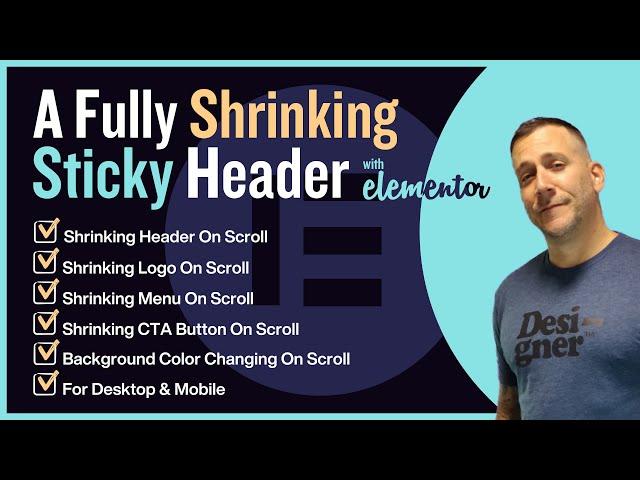
A Fully Shrinking Sticky Header On Scroll With Elementor
Комментарии:

Finally, somebody explain very very VERY simple :) thanks.
Ответить
i got it thank you, i forgot to set !important to color
Ответить
how can i change the font colour from transparent header to shrinking header
Ответить
Does not work with flex-container
Ответить
You referenced the menu that was already built. Do you have a video on building the menu?
Ответить
Hello,thanks for the tutorial. Please what if I want it to shrink after delay instead
Ответить
Hi, anyone got some idea why my header is growing instead of shrinking? I got 20px padding top and bottom and 6px each in the shrinking option..
Ответить
Adjusted the css a bit for the menu items ''horizontal padding'', after scroll, you want to decrease this a bit, the same % as your typography. So if you'd go from 1.5rem size typography to 1.0rem you decrease it with 33%, same you should do with the horizontal padding.
/* shrinking menu */
.shrinker.elementor-sticky--effects ul li a {
font-size: .95rem!important;
transition: all .2s linear!important;
-webkit-transition: all .2s linear!important;
-moz-transition: all .2s linear!important;
padding-left: 1.0rem!important;
padding-right: 1.0rem!important;
}

Great tutorial! Very good explained and worked for me
Ответить
This tutorial is really helpful! Thanks Bro. I tried this with the new Flexbox Container feature of elementor and it doesn't work as expected. I hope you can also create a tutorial for that.
Ответить
Thank you Jeffrey, excellent video as usual, you are an excellent teacher, I like how you share information, is very easy to follow, keep doing what you are doing
Ответить
I dont get why elementor doesnt provide such templates with normal settings..
Ответить
ive bee trying ur tutorial and when i insert the css code, nothing change to my website header. any suggest?
Ответить
Anyone else lose the Customize option? If so, know how to get it back? 🤔 T.I.A.
Ответить
Found your article online and thought it provided instructions for everything I needed for a stick header. Thank you!
Ответить
Love the videos man, everything works great but I have a question.
When on my desktop if I make the window smaller and then go to full screen, the 'shrinker' navbar is broken and stays at the same width as it was. Is there a way to fix that?

Great tutorial! Your explanantin make it very easy. Do you have a solution if you want to make the background transparent but blurry on scroll?
Ответить
Hero!🙌
Ответить
Hi I have the problem on mobile. When the header shrinks then the body jumps up, it is not working smooth. May anyone has this issue too?
Ответить
Hi,
great tutorial, thanks!
I did it and so it works, but only when I am logged in. In incognito browser and also in other browsers like Firefox for example, it doesn't work.
Can it be that it is because of the containers in Elementor? Your tutorial is still with the older version of Elementor.
Thanks for your feedback.

dude I've been bitching and complaining to elementor for almost a year now since THEIR css for this feature stopped working after about version 3.7. THIS works perfectly, even for containers and an svg logo, and I wish I woulda watched this sooner! **EDIT: guess I spoke too soon, I'm noticing that whenever the browser window is adjusted the header doesn't stay full width : /
***EDIT EDIT: So I added "width: 100%!important;" before the "background" line in the css, to both sections and it fixed this issue that I see other commenters mentioning!

For anyone having any visual problems like I did, try adding the !important onto the end lines of your code like so: .shrinker.elementor-sticky--effects {
background-color: rgba(0,0,0,.8) !important; } - This will over-ride any default CSS applied by Elementor.

Hello, i tried it but it is extending my header instead of shrinking it.
Ответить
Thank you, Jeffrey! For sharing your resources and knowledge. Be healthy and successful! 👍🏻💪🏻
Ответить
Great thanks! But unfortunately when I now start zooming on the page with CTRl & Plus/MInus the header is not 100% percent anymore (I set almost everywhere already a width of full with). Is there a way to force in CSS to stay always at 100%
Ответить
What happens with just a hamburger menu only
Ответить
Thank you so much for this video. I have been struggling for days until I came across this video.
Ответить
This is the best and most easy video for this topic. Thanks a lot Jeffrey!
Ответить
This is a great start but it doesn't reset the width properly. For example, if you try to change the width of the window on desktop, it scales everything down but then when you try to make the window wider it keeps the header the size on mobile. It won't stretch back out responsively.
Ответить
Hi @Jeffrey. When I resize the window the header doesnt adjust to desktop.
Ответить
I think I have 2 many elements in my header. My Buttons, Phone and Email all got larger and the transparency never activate.
Ответить
Thanks for you video. If I need to change the menu font color on scroll? Thanks a lot!
Ответить
Thanks a lot sir!
Ответить
Hello thanks for this video, it really helped me. I'm done shrinking my header, but the only thing that I want to get done is changing the text color, I would like to change it from white to black. Do you have a code for this as well? Thanks in advance!
Ответить
mate you're the best. you deserve way more subs.
Ответить
Thank You So Much I was struggling for that from long time but your video make it simple thank you very much
Ответить
I'm having trouble getting this to work with a fluid container for some reason.
Ответить
So for some reason the moment I add in the CSS For the menu the background and shrinking stops. Any ideas?
Ответить
dude, you straight to the point and it's very useful👏
Ответить
very great
Ответить
That's an outstanding tutorial. It worked a treat. Thank you.
Ответить
great video, is so easy with this guide-video
Ответить
Question for you - how can you change the colour of the logo and menu text from say white before you start to scroll to black with a white background when you do scroll down? So basically changing the logo and text colours as well on scroll. Thanks much and keep it coming! Very easy to follow along.
Ответить
Question for your brilliant expertise, please! I used this tutorial and it looks so slick on desktop with a horizontal menu, as you did in the video. But the tablet and mobile versions utilize the hamburger icon, and when you click to drop-down, it only shows the top nav link... the rest of the vertical drop down menu is completely cut off. I tried setting the Z index to 100, and I changed the Elementor Overflow setting from Hidden to Default; but nothing changed. What would you do? Has anyone else run into this? Thanks so much in advance.
Ответить
Question : If we where Shrinking an icon would it be the same as the button ?
Ответить
This is great. What if one has two logos? One logo is for big screens and another logo is for smaller screens.
Ответить
Thank you for this helpful tutorial. I have a menu with 3 columns structure. Is there any possibility of changing/merging the column structure to 1?
Ответить
Dude! Thanks!!
Ответить


![Winterlandschaften bei Leutenberg [Saalfeld - Rudolstadt] Winterlandschaften bei Leutenberg [Saalfeld - Rudolstadt]](https://ruvideo.cc/img/upload/czBJZGh0dVVsYVI.jpg)


