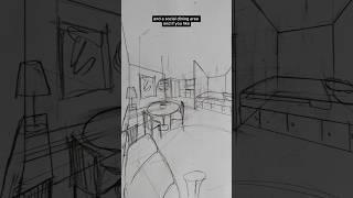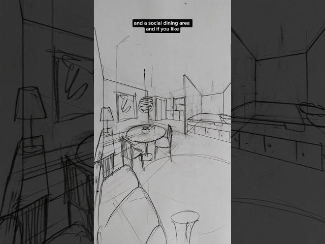
This studio flat is not homey, let's do some light renovations to totally transform it!
Комментарии:

I am so in love with these videos. EVERY TIME you nail it!! Your videos are so accessible and sweet but then the skill is just THERE.
Ответить
Does this guy live in 2x speed?
Ответить
I don’t know how I feel about crawling on to my bed, and if I had to sleep on the wall side I would feel claustrophobic
Ответить
Place the PC desktop outside ??? 😮😮😮😮
Ответить
Bro, design the house for a little job
Ответить
Love watching you draw! 😮
Ответить
You would need to be an acrobat to make the bed unless it easily pulled away from the nook.
Ответить
But where is the penguin going in all this
Ответить
Simply AMAZING !!!
Ответить
I really hate beds with one side at the Wall..in Italy we usually have the best at the center of the Wall with two small forniture on both slides... Just like in hotel...and It Is Easy to change the sheets
Ответить
Wow! You have a gift!
Ответить
They also need a bigger penguin.
Ответить
More space: unlocked
Ответить
Cliff, is it comfy that the wardrobe placed right in front of the door?
Ответить
And giant penguin 😂 cant forget that 😊
Ответить
I think the bed should be turned so you can access both side. Even though its a crab scuttle, you can change the sheets and get to the toilet easier from that side of the bed
Ответить
I hate Bed pushed to the walls
Ответить
Serious respect for your drawing skills!
Ответить
If you can add a curtain to separate the bed, why not put in a sliding door for even an even more separated feeling. It can match the partition that separates the bed from the kitchen?
Ответить
His drawing looks bigger than the space itself.
Ответить
take down the kitchen half wall
shift study table in balcony but on opposite side walls not at the centre
but next I'll prefer
remove dinning table
put seating arrangement in L shaped.
have centre table that can be used for dinning
keep bedroom as it is just shift to murphy bed
other option is
shift bed to upper level if you have sufficient height
and below bed you can have ur dinning table
if shifting closet at entry level then u can keep dinning table next to balcony also

btw why such weird layout was approved in the 1st place?
Ответить
I agree with replacing the rectangular dining table, with a small round one, as it takes up less space.
Ответить
Thinking out of the box. 🥳👍
Ответить
Awful bed location
Ответить
The new design is great!
Ответить
I think I'd turn the bed 90 degrees
Ответить
I wish he'd drawn the penguin
Ответить
You deserve a nobel prize for feng shui architecture/design. 🙌
Ответить
Actually brilliant
Ответить
I think the design is great, but the only problem is that if someone else is on the wall side of the bed they’ll have to climb over the room side person to go to the bathroom 😅
Ответить
Bro’s the REAL galvanized square steel guy
Ответить
my house is set up so strangely i need your help!!!
Ответить
galvanized square steel
Ответить
They own it and they’re living like their rent is over due 😭
Ответить
Is my bro mewing
Ответить
Beautiful solution but I hate that the kitchen, where fires start, is between the bed and the door. Seems like there is no way around that risk.
Ответить
It is really astounding how much a space can be changed by rearranging things. If I ever have the money to build my mother her dream rv (she wants to take advantage of being a remote worker by traveling), I want to hire this man to help make the most of the small space. Also, how is it that hgtv has not begged him to make a show for them?
Ответить
But then wouldn’t the attention be on the bed when ur on the sofa
Ответить
but this extra space thing is a balcony and is outside, so bad idea to put the desk there.
Ответить
How are you so good at drawing a POV with only a few photos to go off of?
Ответить
I love you
Ответить
Way better
I would also add a curtain near bed too

Ok but WHY in every single interior architecture video i see, the TV is always misalligned with the couch and waaaaay too far away and too high... please consider having a proper tv experience when designing an interior (TV alligned with the eyes and the couch with a distance of 2 to 3.5 m between TV and couch depending on the size of the TV)
Ответить
The 3d part scratches my brain so well
Ответить
peng.
Ответить
Wow wow wow
Ответить
The remodeling looks like V's apartment from Cyberpunk 2077
Ответить
Nice work
Ответить
some background, the client had wanted to knock the kitchen wall down anyway, but didn't know what to do next😅
Ответить