Комментарии:

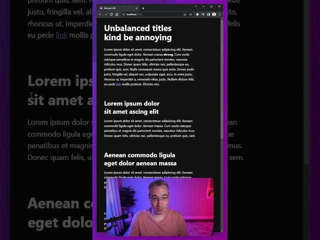
just an FYI, this is called an orphan for anyone curious.
Ответить
Cool new feature! This will make so many Art Directors happy whon you had to tell: "Sorry, we can't guarantee nice line-breaks".
Would also be nice if it was a bit more configurable, like how much it should be balanced. Maybe a value from 0% (not at all) to 100% (the actual reverse, first line as short as possible) and 50% what currently is "balanced".

Zwangsfinanzierter Müllcontent
Ответить
So what’s the exact difference between this and the already existing “white-space” property that seems to do the same when set to “no-wrap”?
Ответить
For those who get a warning using the property, you have to replace it by 'white-space'. This is essentialy the same and the value is still 'balance'.
Ответить
You are awesome. But CSS is also OP
Ответить
Is there a css setting for defining a symbol for the split of a wrapped word?
Ответить
Interesting
Ответить
As someoen who's a perfectionist and my UI always has to be aligned, this is one of the coolest additions. Even better is that defaulting to the normal behavior isnt a deal breaker with the lack of support.
Ответить
so cool! had no idea this existed until today, thanks for sharing
Ответить
This is very
impressive!

I like this. I like this ALOT
Ответить
Can't just postcss take care of the browser support?
Ответить
I always find useful css tips to your channel that's annoying to css. Thank you kev, keep it up Your contents is Gold
Ответить
Thx the king of css ❤
Ответить
بسیار عالی
Ответить
Best change I have seen all year!
Ответить
Oh nice, this popped up in autocompletion and hadnt heard of it but noticed how well it worked in responsive grids
Ответить
Nice😊🎉❤
Ответить
you also can try to reduce word-spacing or letter-spacing when you're just a few pixels top wide
Ответить
Thank you!
Ответить
Finally! Those little overflows are so irritating.
Ответить
Can I use: No you can't 😝
Ответить
But it doesn't
look good like
that.

I used this recently on a project, so thanks for this tip Kevin
Ответить
how do you even keep up with this stuff,
Ответить
Fantastic! They need to have css that counters designers crazy decisions as well 😂
Ответить
It's nice to be up to date with these news!
Ответить
Argghhhh such a long term problem and they come up with a solution like this? How frustrating. The principles of "widows" and "orphans" has been around in typography for years. Why don't they just follow the design rules that have existed for years. This would be a fair addition, but we could solve this with a div width. This now means we'll have headings that are different widths based on the number of words. That's just going to look weird. Especially for outlaying examples like a 3 word heading and a 12 word heading.
Ответить
Saw this in your most recent video it’s amazing.
Thanks Kev!

Omg! Where was this when I had to deal with those long titles on my websites?!
Ответить
OMQ I was just struggling with this trying to Frankenstein it through min-max and stuff
Ответить
I’m shocked that Tex (old as it is) does this balanced wrapping, and css is only now supporting it
Ответить
Want another good typography tip? Explicitly set line-height and letter-spacing (in relative units). Just the act of setting it will make you think about what they should be, which means you'll end up with something better than the default.
Ответить
i also thought this was called an orphan but after googling apparently it’s actually called a runt 😭
Ответить
I usually use special Unicode characters for that, like Non-Breaking Space and Non‑Breaking Hyphen.
Ответить
❤ from India CSS Guru 🙏
Ответить
It’s called an orphan
Ответить
* ...an "orphan" in typography
Ответить
Would be even better if you could tweak it so that the first line is around 60%
Ответить
Life saver!!!
Ответить
also we could do better approach. with white-space:nowrap. it will stay on one line and we could make the font smaller little bit
Ответить
I think it looks worse lol
Ответить
Cool.
Ответить


