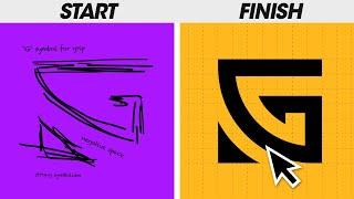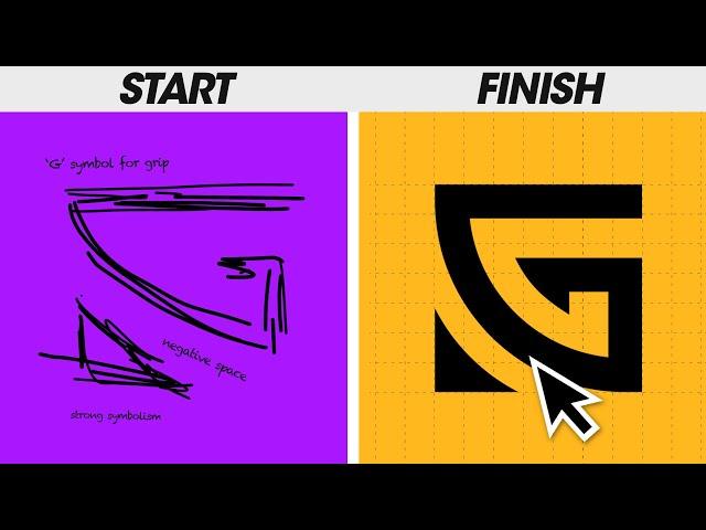
My ENTIRE Logo Design Process (Works Every Time!)
Комментарии:

feeling 😥. for that twist.
Ответить
I kinda cringed at the end on that triangle 🤣🤣 oh well
Ответить
Thanks for sharing The final used logo. I dont like the triangle too, but that means a lot.
Ответить
u look like seregi ramos fr real dude!!!
Ответить
Great info never thought that shapes can express emotions
Ответить
Thank you for this video! I love following along with the process. I'm an aspiring designer, and while I have been pleased with many of my designs, I historically approached it more as an artist than a designer, so my results have been hit or miss... You've made it so clear to me that methodology (and research) is EVERYTHING in the design process. I will be following and watching more of your content!
Ответить
I get why the client wanted a triangle for someone who’s been train in bjj for 5 years.. triangle represents levels and hierarchy which is a pretty big thing in jitz.. great stuff and love the name!
Ответить
Thank you for this video. I am in the trying to make a logo for my jiu jitsu school that I am going to be opening up and this is helpful. I am not a graphic designer but am trying my best to come up with something and this is very helpful.
Ответить
It may not actually suck that the client chose the triangle logo. A triangle actually also portrays togetherness and hierarchy in that field of martial arts. It highlights the importance of leaders and the unity they must defend.
Ответить
That was an interestingn watch! Thank you for sharing.
Ответить
Genius
Ответить
The triangle shape makes more sense in the context of the nature of the brand to be honest. The square design looks more like a gaming team brand than a jiujitsu school.
Ответить
great video can i know the font name you using in whole video?
Ответить
So informative
Ответить
Thank you for the case study on how you designed the logo. It sucks that the client decided to ruin the design with a triangle. However, I feel like you could have picked their brains on why they were so keen on the triangle and you could have figured out a solution where it would incorporate the triangle that they wanted and still make it work properly for their brand. This is something I learned from the "Building a Brand" series of videos from The Futur. With that said, I certainly prefer what you made over the client's suggestion.
Ответить
it's always the client at the end lol
Ответить
Nice work ! From a side angle, the final Logo design looks like one of the hand striking techniques used in Karate. I think it's called "hiraken".
Ответить
owesome!
Ответить
Where is the contract template?
Ответить
I'd be interested in seeing what mockups you showed them. I prefer the simplicity/versatility of your original logo, but for some reason the boxiness and simplicity also makes it looks somewhat "corporate" to me.
Basically, I'm curious how the two logos compare when placed on their uniforms or the wall of the studio (like shown on the website screenshot). I'm wondering if the perfectness of the original logo might have clashed with the imperfections of the context.

Hey did u just reup an old video, i like ur works so much but i just saw a 100% simillar video just 5 min ago, please check it )
Ответить
I asked AI to help me design a logo for a business. The business is pet sitting. With the main focus on dog walking with a speciality or niche for fish especially koi carp disease identification and cure.
AI suggested an informal happy looking dog.
I thought "great"
Then it suggested ....playfully holding a koi carp in its mouth.
I was obviously horrified and suggested we forget the fish part and just go with dog walking.
Then I got the design.
A flat cardboard box with PIZZA written on it.
So I wouldn't worry too much about AI just yet.

Just what I needed
Ответить
A lot of typos in this video, sadly. But overall, the idea and process of constructing the logo is awesome.
Ответить
Excellent. Letters and shapes are images. It is an excellent, very creative logo with many symbolism and meanings. It is sad when the client can't see through the artist's eyes. Your logo is art. Continue creating and bringing your ideas to life. You have a gift. You should start teaching design and typography.
Ответить
nooo chu***e w trójkącie :( Oryginalne było mega lepsze <3
Ответить
Great learning for me!! Thanks a ton! I have one question to you. What thought exactly went behind in 'transitioning' the alphabet "G" which is rounded in shape; to the ‘edgy’ shape which you developed? Nevertheless, I understand the part where you visualized the ‘negative space’ in the alphabet G into a fist viewed from sideways.
Ответить
Hi Satori, I have a question. can't figure out. In Adobe Illustrator when I paste some thing that it was previously in another layer, how do I force it to paste in my current layer. Thank you
Ответить
Hi, can you make a video tutorial about Adobe Illustrator on how to handle it if the project is with links (jpeg, psd, png etc). right now i have a brochure project where I need to link a lot of jpeg and psd images and the file is too big.. maybe you have a tips and tricks to somehow lessen the file size but not affecting the quality of links. thanks.
Ответить
Hello, the discord link has expired, I'm looking for a way to join your server :p
Ответить
The triangle version is actually not bad.
Ответить
Kinda funny how you managed to misspell Jiu Jitsu in so many different ways in just one video 😂
Jokes aside, this is a great video. Thanks for sharing the process

It's a shame the client ended up choosing a different design from what you were thinking. I guess it quite often. But this study case just shows your expertise in this area... Thank you for the good content... Keep it up with the good work.
P.S: I am right behind you...

Last concept tells a good story 👍
Ответить
Thank you for the insights! 😁
Ответить
I am confused, when I look on the client's website, they are not using any of the ones you recommended.
The have the G thing in a silly triangle?

Sir Tom. This was great information to share. Every piece to the puzzle to designing a logo must work together effortlessly, but this is where all you tell graphic designers will in the end be beneficial. Thanks for sharing. Have a great day.
Ответить
Hi Satori, can you make a video on how to create a consistent visual system?
Ответить
It seems like in your audit of the industry sector there was more than a few triangle examples - it almost seems like an industry standard. Did you present or explore any triangle options before the plot twist? Or were you close to finalizing the square when you were blindsided by triangle?
Ответить
Client always wins. I am wondering what you did to try to convince them otherwise and how it didn’t work? I want to know that for my graphic design work.
Ответить
Nice video ....!!❤
Here is one question..
Why client used blue colour for this website?

Can you design a logo of Letter T&G please 🙏
I'm requesting you

Hey man that was a great video, gave me many insights as I'm working on my own personal brand right now, a bit similar graphically to this one. Thanks!
Ответить
Hey man that was a great video, gave me many insights as I'm working on my own personal brand right now, a bit similar graphically to this one. Thanks!
Ответить
I love how you go thru the long process of research, concept creation & fine tuning to create this amazing master piece of a logo with so much depth and meaning….all for the client to pick a G with a triangle next to it 😂 really lifts my spirit to see I’m not the only one being disappointed by my clients
Ответить
This is so well articulated and having a rundown of your thought process is always super informative.
Ответить
A part of me kinda died when i saw the logo he decided to go with :(
Ответить
Amazing
Ответить