Комментарии:

I liked the first and second but the third was not good☺
Ответить
ngl i think the only one thag was improved was green eggs and ram, but that one was just words anyway so not a very high bar
Ответить
the second transformation sucked i hate it
Ответить
I don't really like the fonts I could do better I think. lol 😉
Ответить
I really liked all the logos just I feel a lot of the personality from the third one was taken away and almost over simplified. The other 2 where amazing Keep up the amazing work. =)
Ответить
"Rame"
Ответить
I want to like the 3rd one but I just don't. The redesign lost personality. I feel like the original could've been perfect with just a little bit of finetuning but you completely simplified it. And tbh, the font change was really unnecesarry and not good looking at all
Ответить
God bless ❤ Walk with Jesus and away from sin
Ответить
My Rating is
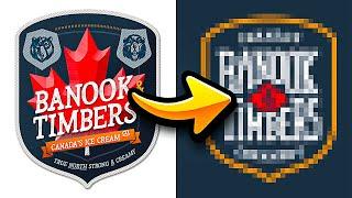
Banook and Timbers
Original is Better
Green Eggs and Ram
New one Better
Troop Detroit
New one is Better

it would be cool to see how my avatar changes;)
Ответить
the second guy didnt use your logo, which kinda sucks because i DO NOT LIKE HIS LOGO AT ALL, buuutt it is his choice...
Ответить
i like the origanal banook and timbers logo better (as a canadian)
Ответить
plzz
Ответить
use our logo plz
Ответить
the Canadian ice cream redesign looks like a alcohol logo
Ответить
❤❤❤❤❤❤
Ответить
the abbreviation for Green Eggs and RAM is GEAR. I feel like something cute could've been done with that! love the redesigns though
Ответить
Bro killed my boy banook
Ответить
For Green Eggs & Ram my thought was to make an egg with a circuit board yolk
Ответить
1st both are good but last one is not so good i like the 1st troop detroit
one better

the last one seems like a oversimplified episode
Ответить
green eggs and ram can be abbreviated to GEAR and that just seems perfect tbh
Ответить
I actually don’t mind most of your changes to the Troop Illustration but I think the cat-eye glasses are too iconic of a feature to completely pass up! It wouldn’t have made it that much more complicated imo.
Ответить
Brandon I think the egg in the Green eggs and Ram logo stands out way too much as the entire background of the logo. It makes the whole logo an egg which makes it look very egg company focused. Just some constructive critism :)
Ответить
The OG Troop logo looked like a chic stylish blonde for a modern bakery. The redesign looks like some old timey military girl. And there’s no indication whatsoever that it’s a bakery
Ответить
I like healthy but yummy chips, i wanna make a chip company :D does anyone have any tips for starting?
Ответить
are the original owners of these brands allowed to use the logos if they wish?
Ответить
did any of them change their logos in the end?
Ответить
its actually kinda sad to think garbage content like minecraft poppy playtime animations are somehow more popular than content with this incredible level of effort, quality, and dedication
Ответить
I feel like the first one was Oversimplified
Ответить
Can you help me trace my logo?
Ответить
This really helps me think through the design process. Thank you.
Ответить
i feel like would be good at this but im just not good at drawing.
Ответить
You didn't seem to get the reference of the Green Eggs and Ram...
Ответить
I like how these aren’t “fixing” designs, but specifically just taking a different approach
Ответить
Ice Cream > Creamery
Ответить
i think the troop logo would’ve been good with the cat eye glasses, adding in the companies personality
Ответить
Green Eggs & Ram was a good redesign, the other one's were complete trash tho
Ответить
I think a clever idea for the Green Eggs and RAM logo wouldve been the fried egg image + some representation of RAM sticks mimicking eggs and bacon
Ответить
he forgot the badger and bear
Ответить
I think you deliberately did a terrible/awful job of the third so viewers would feel compelled to comment! Uh oh.
Ответить
hi
Ответить
I think the second one would be cool if the circuits were egg shaped instead of circles
Ответить
can you do the garza farm logo we make pickles
Ответить
I like the old troop logo
Ответить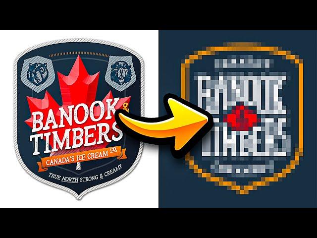


![FNF - YTP Invasion V3 - Smoke (by StashClub) - [FC/4k] FNF - YTP Invasion V3 - Smoke (by StashClub) - [FC/4k]](https://ruvideo.cc/img/upload/WU1Qa2hwaklIdDE.jpg)


