Marketscore NQ Chart 2024-08-01 - Nasdaq (Futures) - Focus Trades
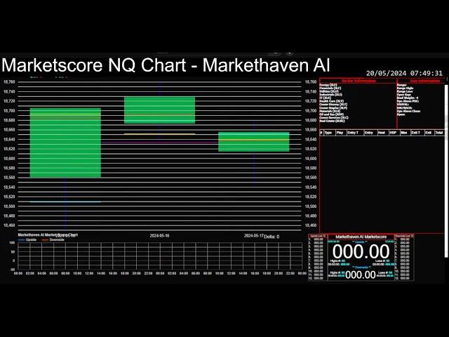
Marketscore is an indicator that I built based on overall market data across the different markets. This stream pairs the Marketscore indicator with the chart for the NQ. The chart is based on 1 minute candles. This chart will show the trades based on a generic model I built around the indicator. It will make a sound for buys and sells. For now, this will be streamed on here while I work to make this a product. If you have ideas or things you would like to see with it just leave me a comment. Watch this video to learn more: https://www.youtube.com/watch?v=FS1m36u467U
Here is how to use the Marketscore NQ Chart:
1. The green boxes are Market Profile (TPO) value areas. The dates below reference the value areas for the previous days. (You can find more about Market Profile by looking up James Dalton - Markets In Profile)
2. There are multiple days as it is likely that there are relevant levels that the current day will interact with.
3. The baby blue line is the open for that the previous date.
4. The yellow line is the close for that previous date.
5. The red line is the POC (Point Of Control) for that date. The POC is the place where it spent the most time.
6. If the price is above the green box I would watch the model trades for longs.
7. If the price is below the green box I would watch the model trades for shorts.
8. If the price is inside of value it is important to watch Marketscore and see what it is leaning toward.
9. There is an audible ding when a buy order is triggered.
10. There are 4 colors for the background of the buys in the Trade Chart.
1. Black - Regular Trades: these are just trades based on the buying model I have configured.
2. Yellow - Caution Trades: these are trades that oppose an already open trade that is doing well.
3. Red - Extreme Caution Trades: these are trades that oppose an already open trade that is doing very well.
4. Silver - Marketscore Focus Trades: these are trades that very likely will do well. Your entry should be able to meet or beat the entry of this trade very often.
11. There is no close signal so you have to use your own judgement for when to get out.
12. Be sure to follow your trade plan and manage risk.
13. The columns to pay attention to in the chart are as follows:
1. Entry - Entry Level: This is the level that the trade opens in the model. You should be able to meet or beat this level. There are times when the market is moving quickly that isn't possible. Watch the Marketscore chart to try to understand what the market is currently doing to help gauge this.
2. HBP - Heat Before Peak: This is the amount of heat that this trade would take from the Entry Level to the Max column.
3. Max - Maximum Profit: This is currently the maximum amount of points possible from this trade.
14. Marketscore Chart - This chart is at the bottom of the page. This chart shows an Upside and Downside score for the Marketscore data. This is based on multiple data points from across the market. This shows a calculation of pressure from buyers (Upside) and sellers (Downside) at the time of the calculation. The Upside and Downside are separate because often buyers and sellers put different types of pressures on the price action.
1. Highs - New Highs for Upside/Downside: This shows how many times the score has created a new high.
2. Lows - New Lows for Upside/Downside: This shows how many times the score has created a new low.
Комментарии:
Dino Dvornik - Peti Element 444 Hz
FLAWLESS
minha rotina da manhã
Samira França 😊
Vou Deixar - Paula Lima
bruninhovillani10
आता शिका Import Export live | Import Export live training Programme Pune
Dr Omkaar Hari Maali


